Client-facing studio work spanning tea gift packaging, graphic extension, and small-batch commemorative product studies, with a focus on visual execution, packaging application, and presentation support.
Studio Context
During this period, the studio’s work centered on external commissions rather than internal product development. The projects were practical and execution-heavy: packaging, visual design, and small-batch object proposals that had to move quickly from idea to presentation material. The work shown here mainly covers a tea gift set developed for the Research Center for Heritage Conservation and Urban-Rural Development at Tsinghua Tongheng, together with supporting studies for small commemorative products.
Tea Gift Set Design
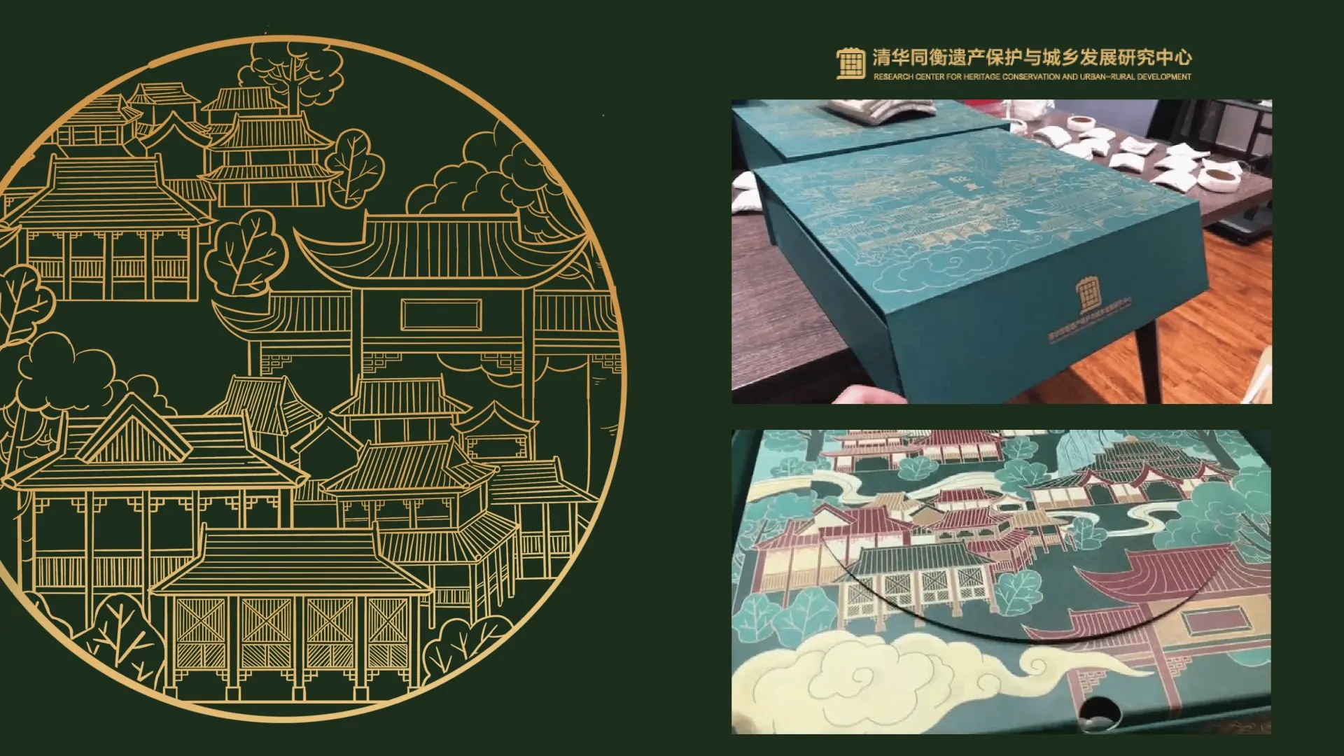
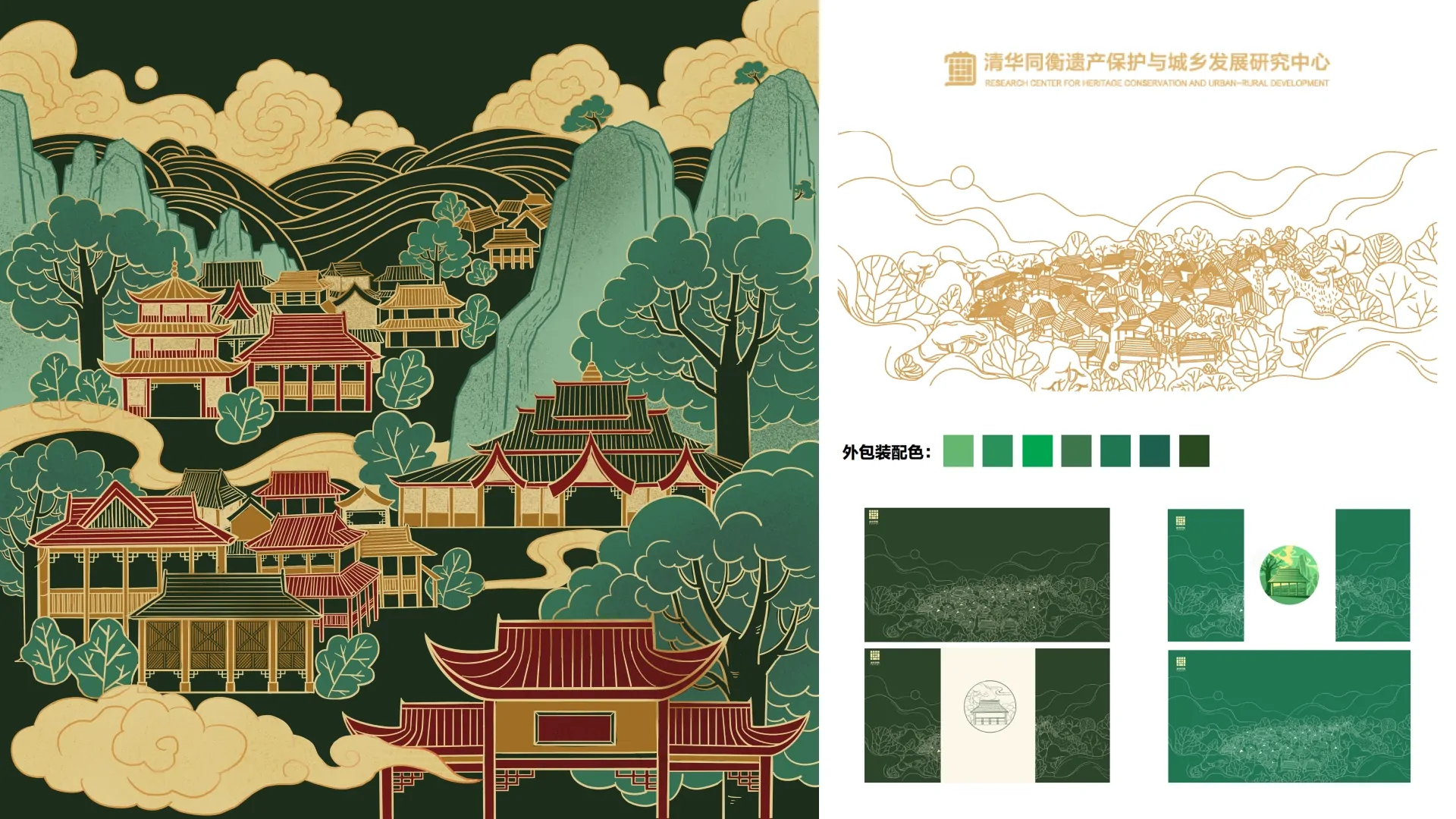
The tea gift set translated an institutional and heritage-oriented brief into a more ceremonial packaging language. The visual system drew on traditional Chinese architecture, layered mountain silhouettes, trees, and cloud motifs, which were first developed as line drawings and then expanded into a fuller color illustration. A dark green base with gold detailing established a formal tone, while the denser architectural scene gave the box a stronger sense of place and cultural identity.
The work extended beyond a single hero graphic. The illustrated language had to be adapted across different packaging surfaces and states, including the main lid layout, wrapping surfaces, seal-like circular graphics, and alternative color applications. In that sense, the project was not only about creating one image, but about building a reusable packaging system that could remain coherent when applied to a real box structure and photographed sample.
Small-Batch Product Studies
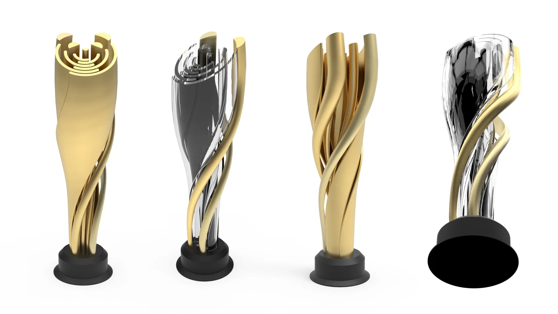
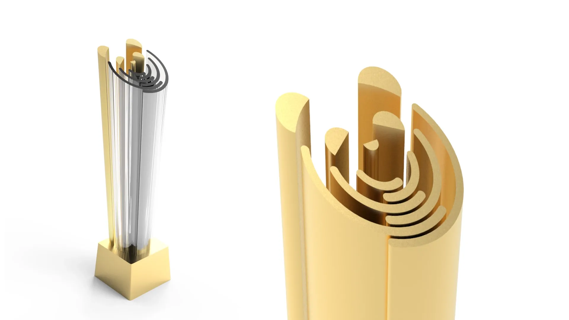
Alongside packaging design, the studio also worked on small-batch commemorative or display-oriented products. The renderings shown here reflect that part of the workflow: compact sculptural objects that combined metallic framing with transparent inner volumes, using contrast in material, silhouette, and rhythm to create a more ceremonial presence. These studies were less about mass-production engineering and more about communicating formal intent clearly enough for internal review and client discussion.
This side of the work required a different design emphasis from the tea packaging project. Instead of flat graphics and layout adaptation, the focus shifted to proportion, structural layering, and the visual effect of reflective and transparent materials. Even at a support level, this made the internship span both 2D visual execution and basic 3D product expression.
Studio Workflow
Because the studio worked directly with external clients, design quality depended not only on the concept itself but also on speed of revision, clarity of presentation, and the ability to turn ideas into files that could actually be discussed and delivered. Packaging graphics, renderings, layout boards, and revised versions all had to support communication with relatively little room for abstraction. Within this workflow, the emphasis stayed on translating visual ideas into clear, editable, and presentation-ready assets for packaging and small-run product proposals.